Key Output
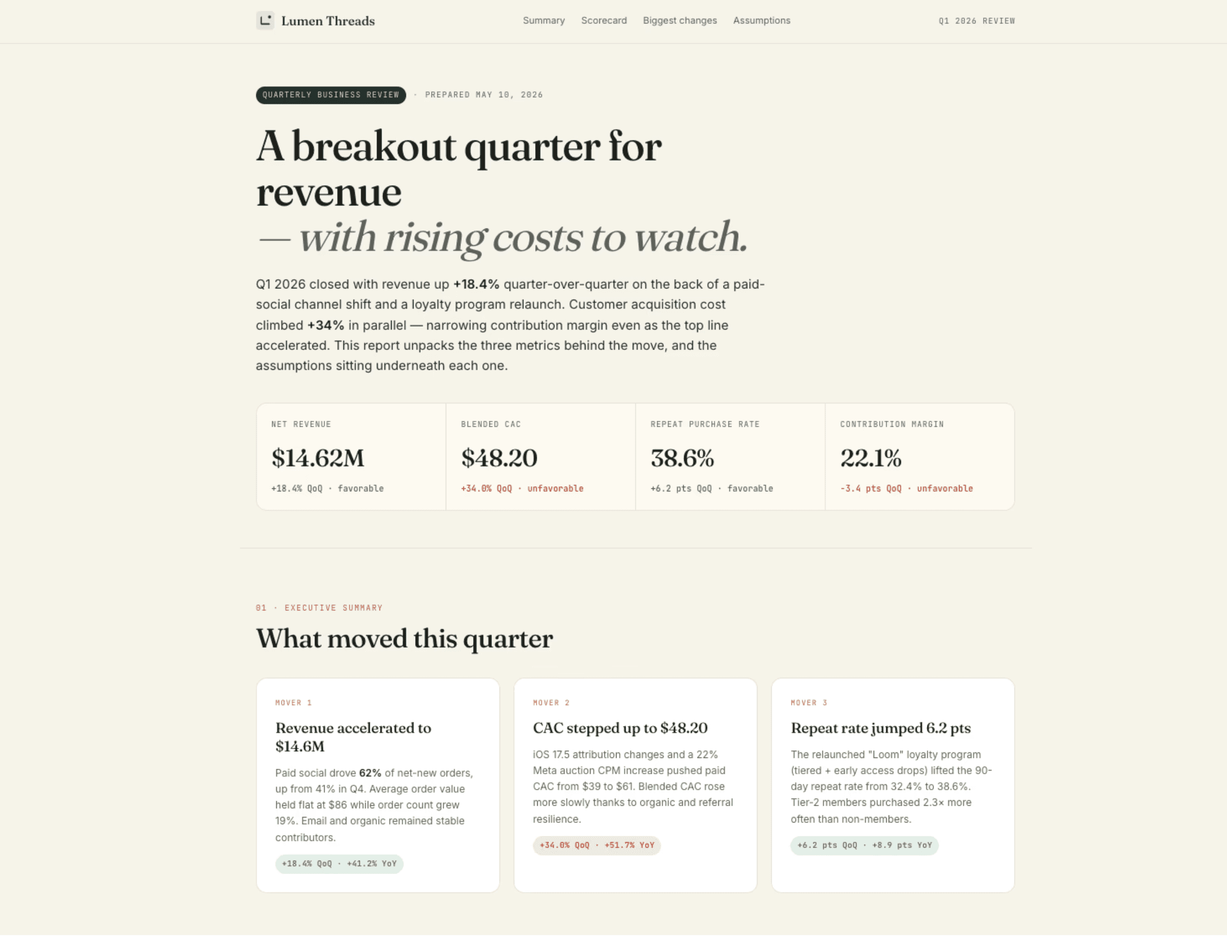
Computer produces a polished, single-page web report deployed to a private shareable URL. The Executive Summary opens with a one-line headline and a TL;DR of the three biggest movers, giving any reader the story in under 15 seconds.
The KPI Scorecard is a four-tile dashboard covering Net Revenue, Repeat Purchase Rate and Contribution Margin, each with an inline sparkline and color-coded favorable/unfavorable arrows so the verdict is unambiguous.
The Biggest Changes section unpacks the three movers in depth. Each mover includes a trend chart, a horizontal-bar waterfall of contributing factors, and an "Assumptions Called Out" box listing the methodology choices that would change the headline number.
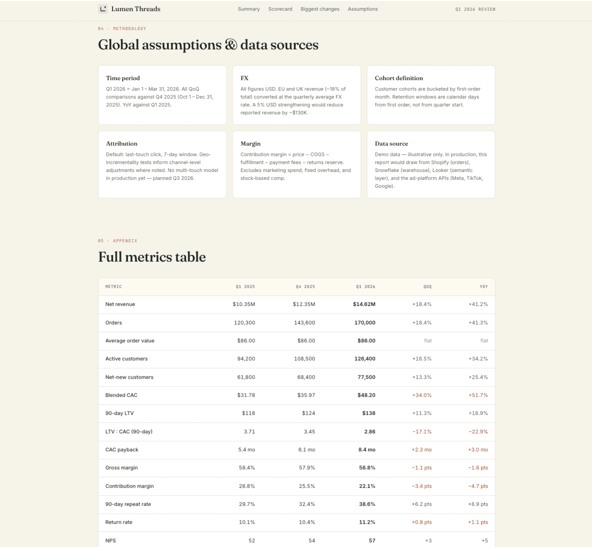
The Methodology and Appendix sections disclose attribution window, cohort definition, FX treatment, and data lineage, then close with a full 14-KPI table across Q1 2025 / Q4 2025 / Q1 2026 with QoQ and YoY deltas, color-coded for direction.
Computer also handled the entire production loop end-to-end — drafting the HTML, CSS, and Chart.js code; running multiple rounds of visual QA via screenshots; fixing layout bugs (KPI grid overflow, a truncated annotation, a missing legend item, arrow-color semantics on unfavorable metrics); and deploying the final report to a private link ready to share externally.
Tips
Anchor the structure if you have a preference: The default plan includes executive summary, KPI scorecard, biggest-changes deep dives, and an appendix. If you want a different shape ("lead with risks," "add a forward-looking forecast section," "drop the appendix"), say so before approving the plan.
Call out the metrics that matter to your audience: If you don't specify, Computer picks a sensible default set (revenue, CAC, retention, margin). Naming the 4–6 KPIs your readers track — NRR, payback period, gross margin by channel — gets you a more relevant scorecard.
Ask for the assumptions box: Requesting "assumptions called out for each major number" turns a pretty chart into a defensible one. It's the difference between a slide deck and an analysis your CFO will trust.