Key output
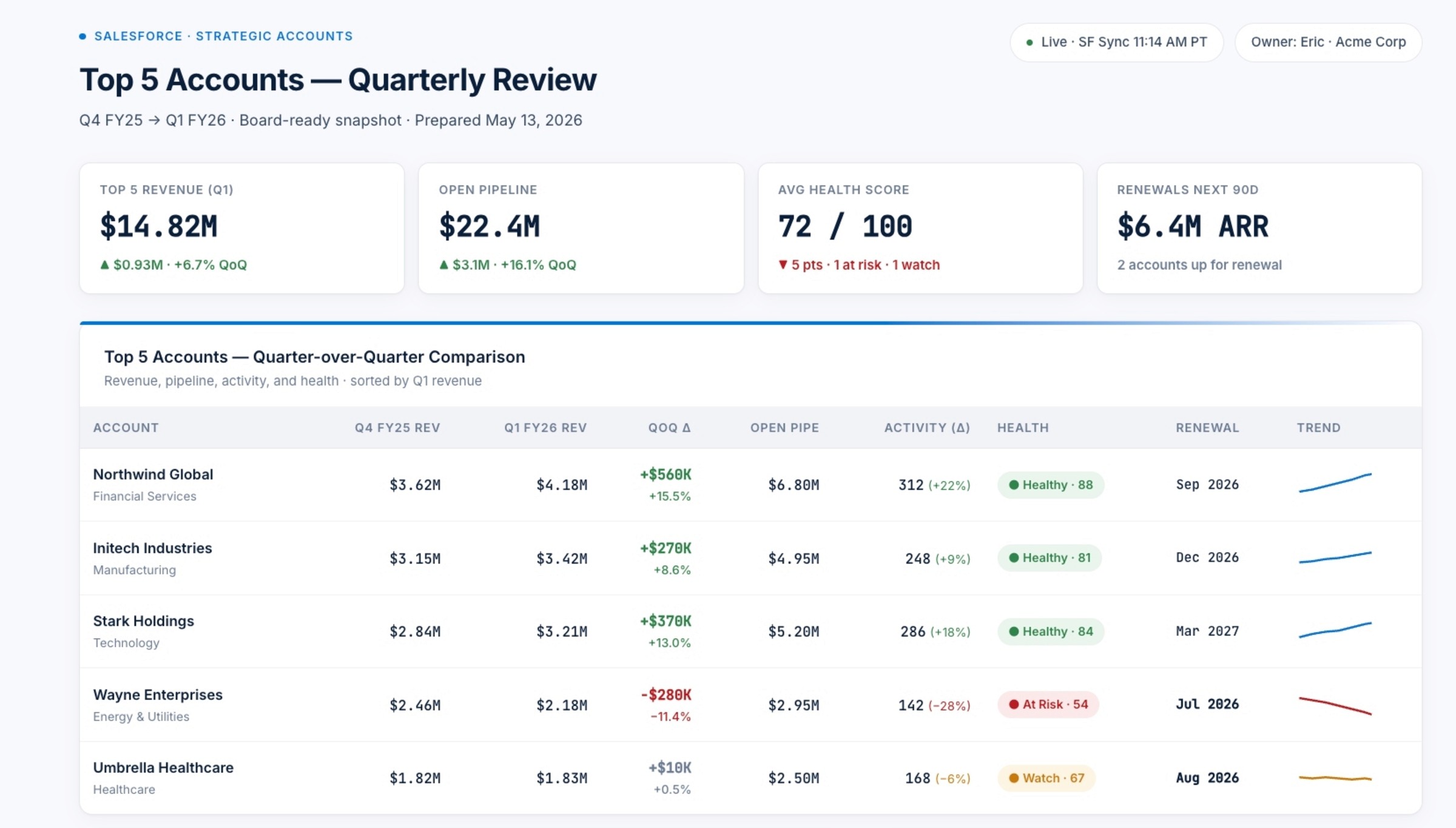
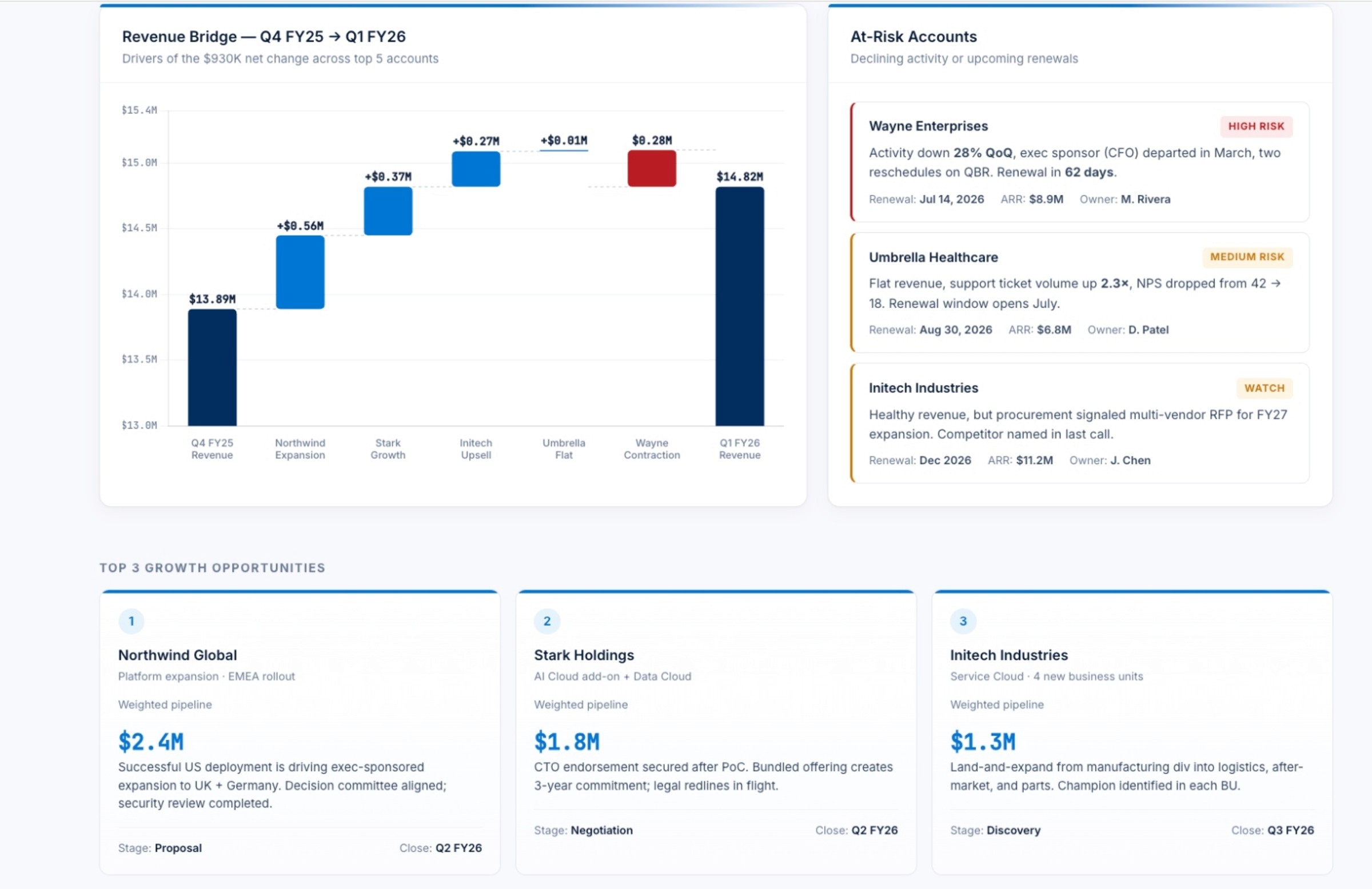
Computer assembles a clean comparison table of your top five accounts, pulling quarter-over-quarter metrics such as closed revenue, pipeline value, key activities, and renewal dates directly from Salesforce so board members can quickly see how each relationship is trending. It then adds a waterfall-style view that breaks down what contributed to revenue changes—new deals, expansions, churn, contraction, or slippage—making it easier to explain why numbers moved rather than just showing that they did.
On top of that, Computer produces a risk panel that flags accounts with declining engagement, shrinking pipeline, stalled opportunities, or near-term renewals, alongside a highlight of the top three growth opportunities based on momentum, whitespace, and recent activity. It wraps everything in a clean, executive-ready layout that uses Salesforce blue for accents, and closes with three concise insights and recommended next steps leadership can act on immediately—such as where to focus executive sponsorship, which accounts need save motions, and where to double down on expansion.
Key tips
Be explicit about which Salesforce objects and fields matter most (for example, specific opportunity stages, activity types, renewal dates, and account health indicators) so the dashboard focuses on the metrics your board actually tracks instead of every available field.
If your definition of “top accounts” goes beyond revenue like including strategic importance or product adoption spell that out in the instructions so Computer can select and rank accounts in a way that matches your internal view.
Once you like the structure, reuse the same prompt before each board or QBR cycle and only tweak the time window or filters, so Computer consistently produces a comparable, period-over-period view your leadership team can scan in minutes