Key Output
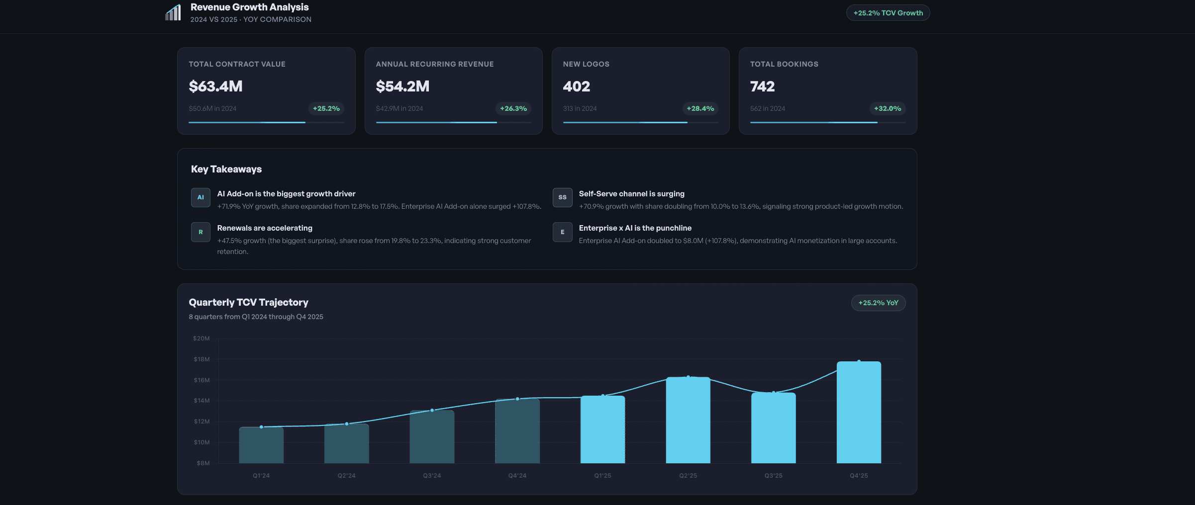
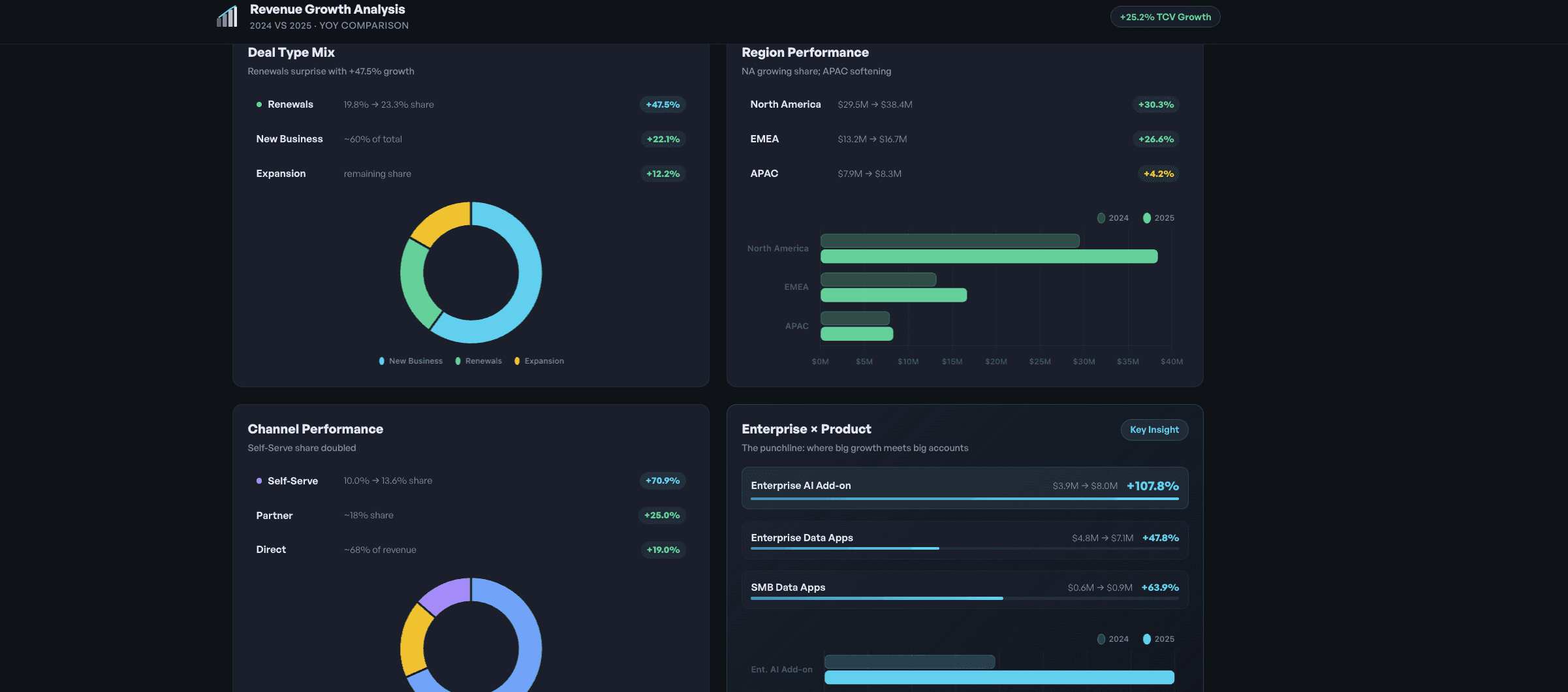
Computer produced a "Revenue Growth Analysis" dashboard and a detailed narrative breakdown covering ten dimensions of YoY growth.
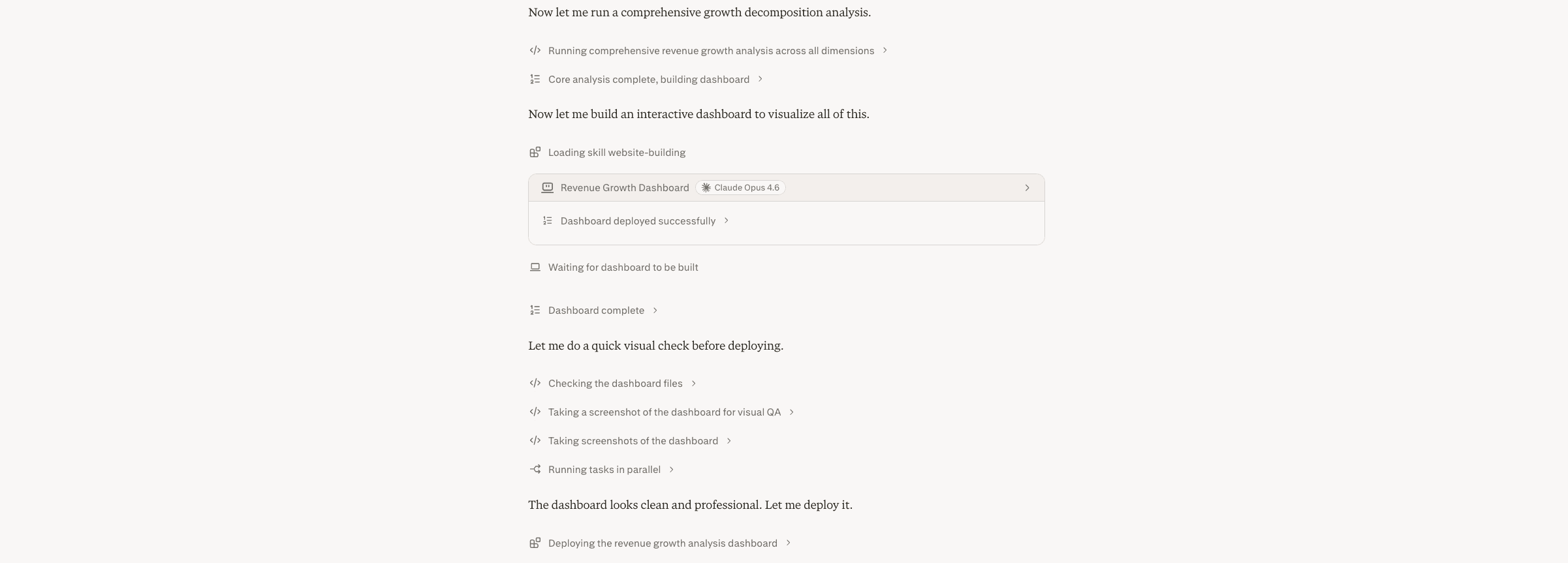
It started by reading three attached data files and checking the live Snowflake connector in parallel, identifying which source held the relevant bookings data. It then ran a full Python analysis covering overall annual totals (TCV, ARR, Month-1 recognized revenue, services), segment-level growth (Enterprise, Mid-Market, SMB), product line mix shifts, regional trends, deal type breakdown (New, Expansion, Renewal), sales channel performance (Direct, Self-Serve, Partner), quarterly trajectory, cross-segment × product matrices, discount and margin trends, and a month-by-month H2 detail view.
The final output is a deployed interactive web app with charts and filters for each dimension, plus a written executive summary highlighting the four biggest growth stories. It makes it ready to drop into a board deck, share in Slack, or use as the basis for a quarterly business review.
Tips
Attach or connect your actual data: Computer works with CSVs, Excel files, and live Snowflake connectors. If your data lives in Snowflake, just say "check Snowflake" and it will explore available schemas automatically.
Be vague on purpose: A broad prompt like "where is growth coming from" lets Computer decide which dimensions matter. If you already know the cuts you want, specify them (e.g., "break down by product line and region only").
Ask for the story, not just the numbers: Follow up with "What are the 3 things I should tell my CFO?" or "Write the exec summary for QBR" to get a narrative layer on top of the data.