Key Output
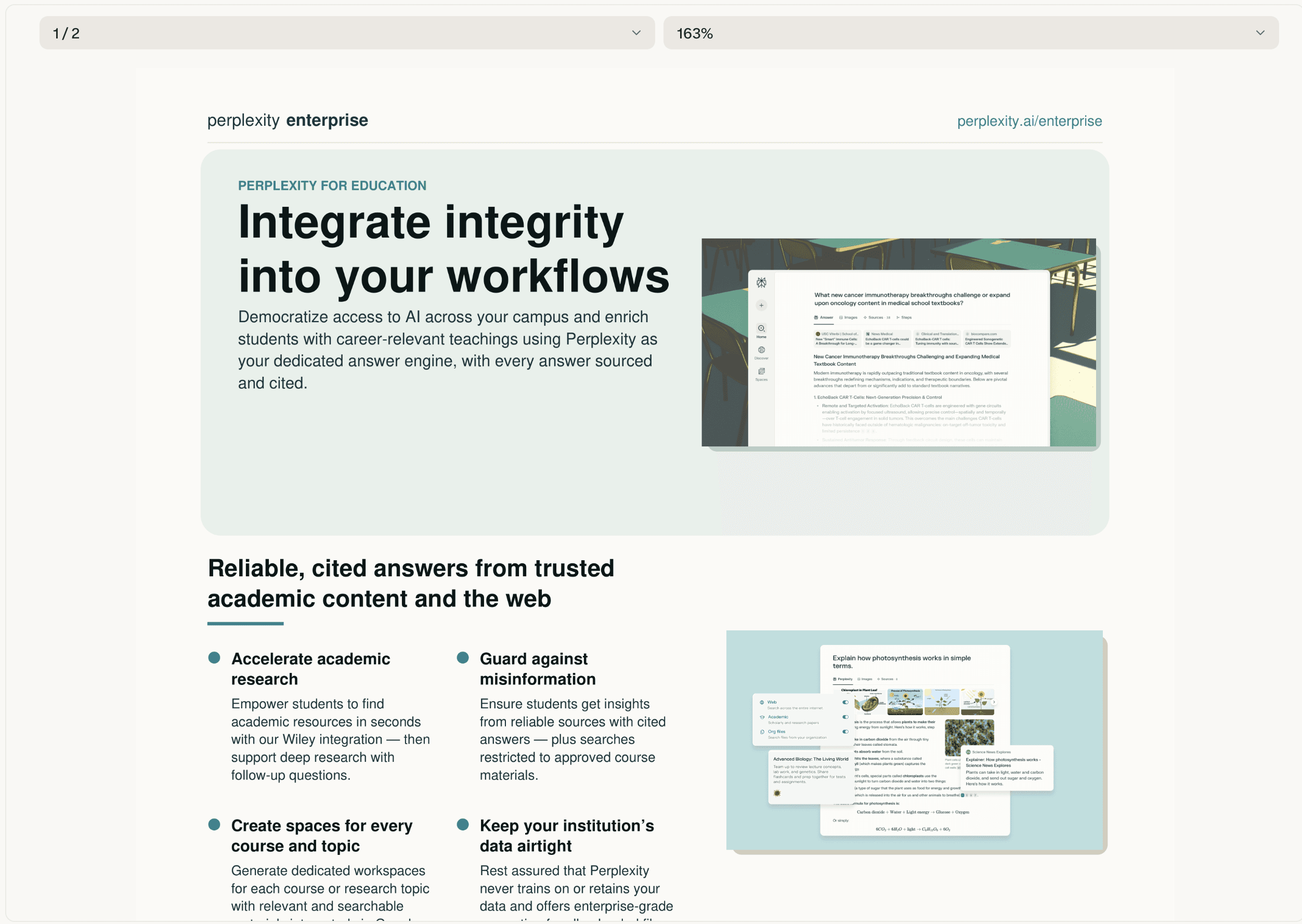
Computer scraped both landing pages, pulled every headline, feature description, product screenshot, testimonial quote, and Space card visual, and then rebuilt them as double-sided PDFs following the finance one-sheet structure.
Each front page mirrors the live hero section with a full-width UI mockup, the core value prop headline, and a feature grid with supporting product screenshots. Each back page includes a customer testimonial with name and org, sample research questions styled to match the original page, a gallery of Spaces cards with illustrations, and a CTA footer with contact details.
Computer preserved Perplexity's brand colors (teal, navy, off-white) and typography so the PDFs feel native to the brand. Both files are print-ready and can be emailed, uploaded to sales enablement platforms, or distributed at events without further editing.
Tips
Specify layout constraints – Give Computer explicit guidance on page structure, for example: "Front page must fit on one 8.5x11 sheet with 0.5-inch margins, back page should use two-column layout for sample questions."
Control asset quality – Tell Computer how to handle images, for example: "Use high-resolution screenshots at 300 DPI, compress file size to under 5MB for email delivery."
Define branding guardrails – Lock in visual standards, for example: "Use only brand hex codes (#00A8A8 teal, #0A2540 navy), set all body copy in Inter 11pt, headlines in 24pt bold."