Key Output
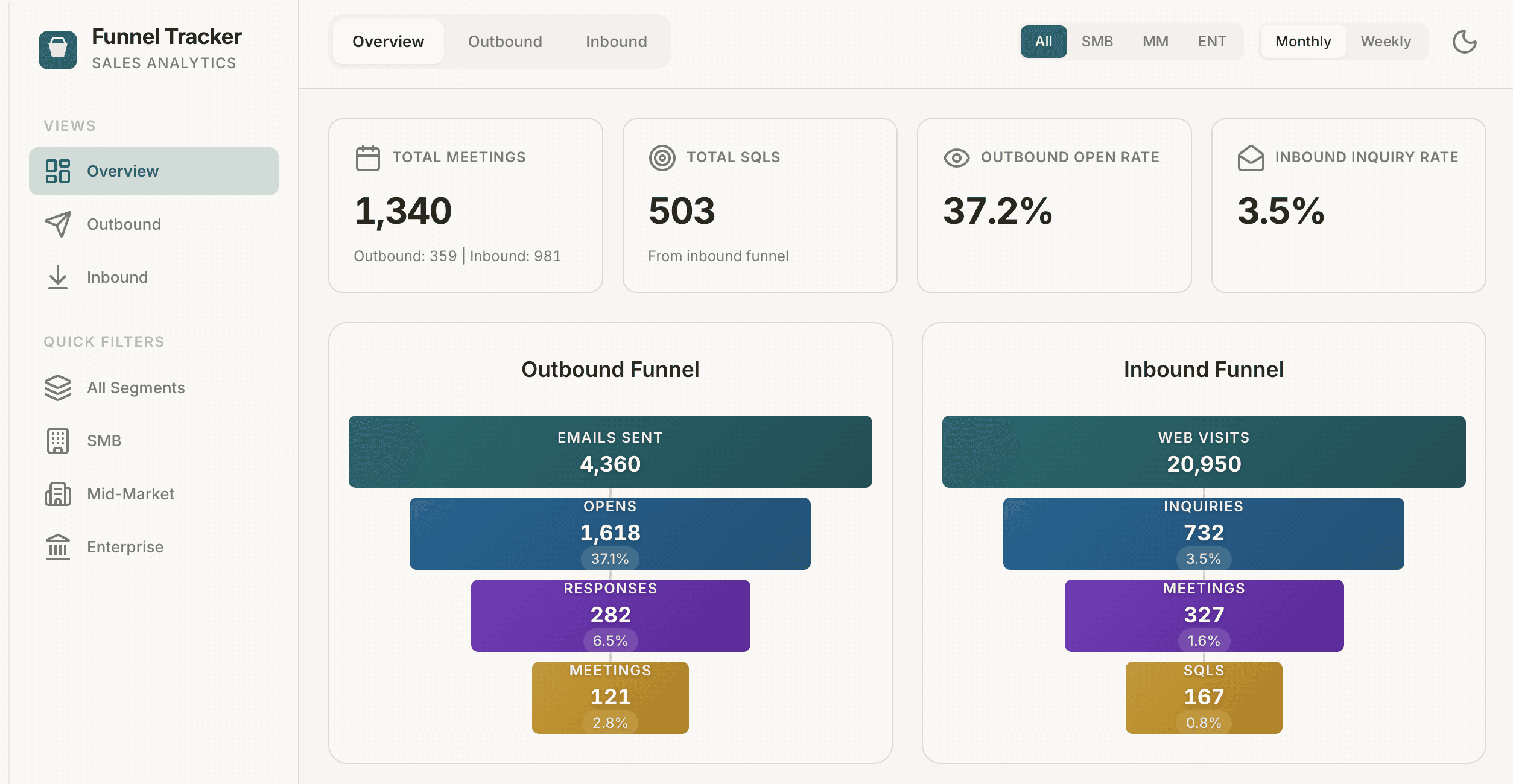
Computer shipped the “Breathe Easier Funnel Tracker,” a three‑tab web app that unifies inbound and outbound funnel health in one place.
The Overview tab shows a combined lead‑generation view with side‑by‑side inbound and outbound funnels, total meetings and SQLs across both channels, trend charts, and a segment breakdown table so sales can see where volume and quality are really coming from.
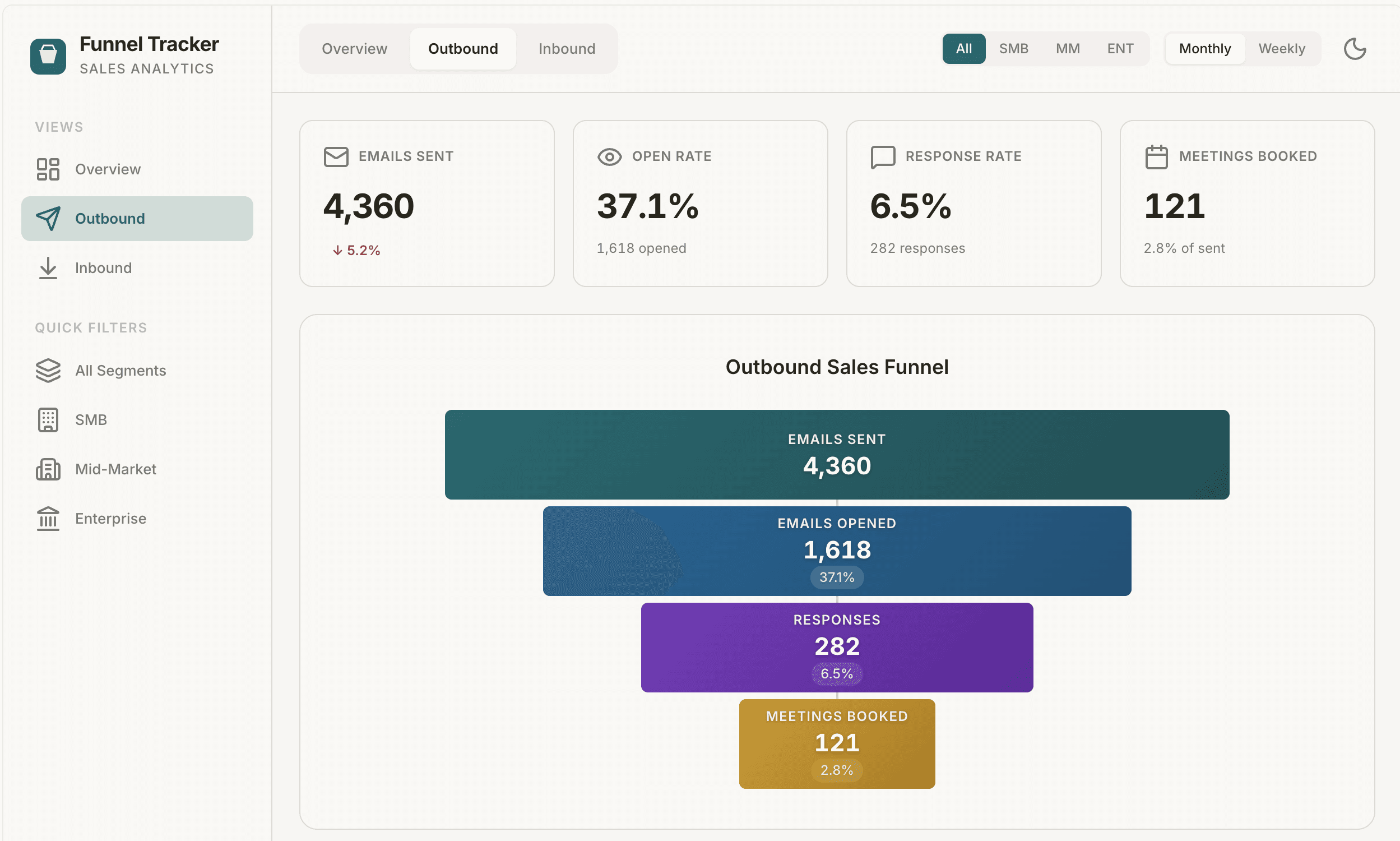
The Outbound tab renders a large funnel from Emails Sent → Opens → Responses → Meetings with KPI cards, conversion‑rate tiles, monthly volume inputs by segment, and a Key Reports panel for pasting in links to detailed outreach dashboards.
The Inbound tab mirrors this with a funnel from Web Visits → Inquiries → Meetings → SQLs plus editable conversion sliders: Inquiry → Meeting, Meeting → SQL, and SQL → Win Rate, all scoped to inbound only.
It also includes editable ACV fields for SMB, MM, and ENT and uses your monthly volume estimates to auto‑calculate estimated pipeline value by segment.
A global segment filter (All/SMB/MM/ENT) and a Monthly/Weekly toggle (which derives weekly numbers from monthly via a 4.33 factor) update all views in real time, while dark/light mode and per‑tab Key Reports sections make the app ready to share with the sales team as their single source of truth for funnel health.

Tips
Define your “good” benchmarks – Tell Computer what healthy conversion looks like, for example: “Highlight any segment where Inquiry → Meeting drops below 15% or Response → Meeting below 5% in red.”
Clarify ownership and cadence – Add instructions like: “Assume sales ops updates volume and ACV monthly, and AEs review the Overview tab in our Monday pipeline meeting.”
Shape report linking – Specify link usage, for example: “Use Key Reports primarily for Salesforce dashboards and outreach tool reports, and group them by ‘Volume’, ‘Quality’, and ‘Revenue’ for easy scanning.”